
<video autobuffer controls width="100%" height="auto">
<source src="https://ub.uni-leipzig.de/fileadmin/Resources/Public/videos/2016_textkuenste_web_02.mp4" type="video/mp4" />
Schade – hier sollte ein Video abgespielt werden. Leider scheint Ihr Browser kein HTML5 zu unterstützen.
</video>
Images
The first given shelf mark indicates the origin of the digital image (UBL = Leipzig University Library, BmL = City library of Lyon)

Plautus: Comoediae [Comedys, lat.], Venise: Simone Bevilacqua, 1499 [UBL: Poet.lat.3b / BmL: Rés Inc 467]
Giovanni Pietro Valla comments on the ancient comedy "The girl Casina" by Plautus (2nd century BC). His text is formatted like a dialogue, with large letters opening every paragraph. The initials were added by hand and give more optical weight to the paragraphs as well as structure the mass of narrowly filled lines.

Pliny the Elder: Historia naturalis [Natural history, lat.], Parma: Andrea Portilia, 1481 [UBL: Med.lat.7 / BmL: Rés Inc 944]
This encyclopedia from the 1st century is a complete edition. At the end of book 7 it deals with clocks, and at the beginning of book 8 with elephants. The printer has left some space for initials of various sizes which somehow seemed more significant to him than the chapter titles.

Johannes Eck: De primatu Petri adversus Ludderum [For the rule of the pope, against Luther, lat.], Paris: Conrad Resch, 1521 [BmL: Rés 109182 / UBL: Syst.Theol.74]
Theologian Eck became famous for his 'Leipzig disputatio', a public discussion with Luther in 1519. When Eck published this book in 1520, he is still battling against Protestantism and showing Luther at odds with the whole church. Title and chapter numbers belong to a separate font of letters, like the header. At the same time, the large initial steals the show when it comes to structuring the text.

Desiderius Erasmus: De ratione studii [About learning, lat.], Strasbourg: Johann Herwagen, 1524 [BmL: Rés 807915 / UBL: Päd.8225]
The title in the text is generated by upper case letters, at least in its first line, set more narrowly than the upper case letters in the header above. Looking more closely, it becomes apparent that the upper case letters do not belong to the italics used for the lower case.

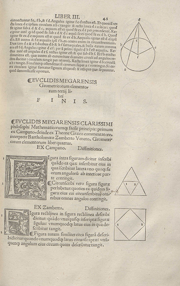
Euclid: Elementa Geometrica [Geometry, lat.], Paris: Henri Estienne, ca. 1516 [BmL: 107466 / UBL: Geogr.gr.38]
This first French print of Euclid's textbook on geometry (originally written in the 3rd century BC) made it a European standard. Euclid's text ends on the right page shown here, and commentaries by Campanus, Theonin, and Zamberti then begin. The text itself is formatted in various ways: different font sizes, titles, printed paragraph marks and initials help to structure the content. In addition, woodcuts with geometrical figures take up some of the marginal space, left extra-wide throughout the whole volume.


